What Color Banding is and How to Deal With it

What is color banding?
Color banding, or posterization is an ugly artifact that can be seen in digital images. It’s most often visible in a gradient between two similar colors. Banding refers to the visible change from one color to another instead of a smooth, fading gradient.
You’re most likely to see color banding in gradient backgrounds you create for your renderings or in photographs, natural gradients like skies are prime for color banding.
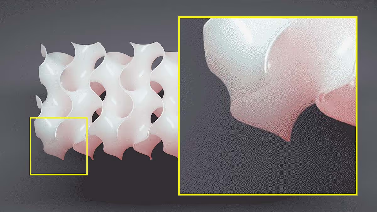
While a bit exaggerated, the image below is a good example of color banding. Let’s take a look at some nerdy technical stuff so we can identify how to fix or avoid this from happening in your work!
What is bit depth?
Bit depth is the primary cause of color banding. And it’s worth understanding because it’s relevant to lots of aspects of rendering, animation and digital image making.
Bit depth is how we describe the color information stored in a digital image. Think of bit depth as a capacity. Higher bit depth formats store more color data.
A 1 bit image can only store two values, either 0 or 1. 0 would be equal to black and 1 equal to white, resulting in a black and white image only (no grayscale values).
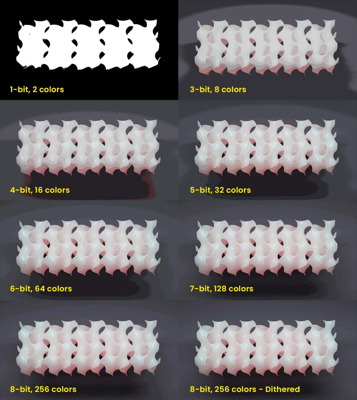
- An 8 bit image can store up to 256 colors.
- A 24 bit image can store over 16 million colors.
- A 32 bit image can store over 4 billion colors.
Wait a minute… 16 million colors?! 4 billion colors?! If you’re thinking that there’s no way there are THAT many colors, you’d be right. When talking about bit depth the word ‘color’ is thrown around loosely. To be more accurate, we’d use the term value since digital images are made up of pixels. And each pixel is assigned a value, which we informally refer to as color.
Higher bit depth images also dedicate more bits or values to something called Alpha, which is another term for transparency. Having more bits dedicated to alpha allows an image to be rendered more accurately from a technical standpoint.
Zooming back out though, all you need to understand is that digital images are often in either 8, 16, 24 or 32 bit depth. And the higher this number, the larger the file and the more values the image can potentially store.
What is dynamic range?
Dynamic range refers to the contrast between the brightest and darkest part of an image. If you take a photograph of a candle in a completely dark room, the dynamic range will be considered relatively high since the image will contain black values where the room is dark and near white values at the center of the candle flame.
In some cases, the dynamic range is so great, a camera can’t capture all the detail in the dark and bright regions at the same time. Take a sunset for example, the sun is so bright compared to the landscape around it, your photos often lack detail in the brightest and darkest parts of the image.

Many high-end cameras today can capture high-dynamic range images. Special 32 bit image formats are often required to store such an extreme range in values.
What causes color banding?
Despite cameras being able to capture HDR images in 32 bit formats, our digital displays are almost all limited to displaying only 8, 10 or 12 bits of color depth at a time. This means naturally, that some of the values contained within a 32, 24 or 16 bit image are discarded or not displayed on our computer or tv screens.
The same goes for images you render on your computer. Many render engines operate in a 32 bit color space. But again, chances are, your monitor can only display 8 or 10 bits at a time.
When you start discarding some of those bits, you’ll be most likely to see that missing information in smooth gradients between similar colors. Your monitor doesn’t actually discard bits of information, it’s just not capable of displaying them, so you don’t see them even though the image may contain more bits that you are not seeing.
The other scenario in which bits of information is discarded is during image compression. We compress images so they take up less space. You’ll most often notice this in larger image formats like videos where there are thousands of images per minute of footage. With so many images and videos being stored online these days, image compression happens in nearly every piece of media. This is achieved by discarding bits of information and reducing bit depth which can also cause visible banding and posterization.
So, in short, the two major causes of color banding or posterization are first, your monitor’s bit depth and second, the compression or bit depth of the digital image.
Level up your KeyShot Rendering skills
What can be done to reduce color banding?
So, we already know that color banding is happening due to bit depth reduction and monitor bit depth. Let’s address the first issue with the image.
Avoid low-contrast, subtle gradients
The best and only real way to avoid color banding is to avoid scenarios in which it is most likely to occur. This is easier said than done, but going out of your way to not introduce subtle gradients that take up a lot of the frame is the best way to avoid posterization.
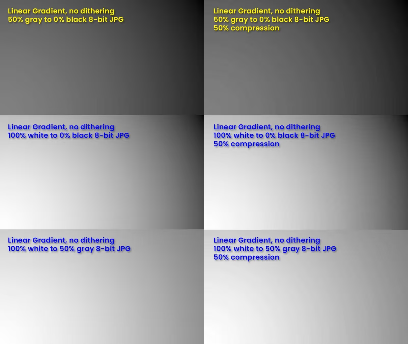
For example, if you’re using a gradient backdrop or have a gradient on the ground where a shadow fades out, try increasing the contrast in these areas. This could be done by using different colors, but mostly will rely on value (light vs dark). This is further exacerbated by image compression. In the examples below you can see what happens when the JPG is compressed by 50%.
Output a higher bit depth image format
To avoid banding from compression when rendering, we just need to output a different image format that has a higher bit depth. For example, if you render a JPG, you’re getting 8 bits per color channel. Image formats such as TIFF, PSD or EXR all support greater bit depth. PNG (at least in the case of KeyShot) will typically be 8 bits + alpha, so that’s not going to make much of a difference.
Whether you render TIFF, PSD or EXR formats will largely depend on what program the file will have to be read by. If you know you’ll be going to Photoshop to make some edits, then PSD will work fine. TIFF is a bit more universally supported and EXR is the standard format for VFX and compositing.
It’s worth mentioning that 32 bit image formats can only be edited in a limited number of ways in Photoshop since it doesn’t natively work in 32 bit space. However, other programs like Affinity Photo, Fusion, Nuke, After Effects and others will happily work with 32 bit data without having to change the bit depth.
Minimize color correction in post
When color correcting or adjusting curves or doing other tone mapping processes in post production, you are more likely to cause color banding or posterization. Getting the image’s color and values before rendering is ideal, reducing the amount of color correction needed in post production. Additionally, having more bits of depth will give you more latitude when color correcting before artifacts appear.
Use Dithering
Dithering is the process of breaking up the posterization by adding noise to the image. The hard lines or bands you see become stippled by offsetting pixel values.
Film grain is not the same as dithering, but they are a bit similar to the human eye. Dithering is often used on still images, but adding some noise as well as film grain to an animation can go a long way in breaking up visible banding.
Avoid compressing the final deliverable as much as possible
If you are delivering an image or animation to a client, it’s your job to deliver them the highest quality possible. This results in massive file formats that aren’t always ideal for embedding on a website or uploading to social media.
However, it’s your client’s job to take your high-quality deliverable and encode or compress it to meet their needs depending on where they plan to use it. When compressing an image or video file there is no way to avoid visual degradation. Even the companies with the most resources have to live with this fact. Don’t believe me? Watch this Apple commercial below. Even Apple has to deal with the ugly posterization and banding happening in any shots with dark gradients.
https://www.youtube.com/watch?v=oMf_i1YBuMk&ab_channel=Apple
Even Apple has to put up with color banding in the darker areas of gradients. Watch the video above to see them.
Use a fancy high bit depth monitor?
Now, onto the second cause of banding–your monitor. You can go out and spend thousands of dollars on a high bit-depth monitor. This will be able to display more color depth than your basic consumer-grade monitor. Will it help reduce the amount of visual banding you see? Probably.
Remember that most of the world is using cheap monitors and they will see that banding even if you don’t. So, it’s honestly not worth using a fancy monitor to reduce the banding you see. It’s better to use a monitor that matches what most people will see and try to make your work look the best it can on that monitor.
So, is it even worth trying to address color banding?
In short, there’s not a ton you can do to control if color banding happens in your work. I still think it's useful knowing the causes of banding. This might help you avoid running into the issue.
The only times in which color banding or dithering can be largely addressed is when the final delivery will be displayed on a device capable of showing a higher color depth than a typical consumer-grade monitor.
For example, in cinema, there are specific file formats and color spaces used by theater projectors. The environment and projector is controlled and the projector is capable of playing very large file formats in real-time. Filmmakers can deliver a file for theaters that is less compressed than a typical video file. The rest of us are limited to following my recommendations above for reducing or avoiding color banding all together.
I hope this cleared up some questions and helps to explain why you see these ugly artifacts. Rest assured, they’re not as big of a deal as you think. Plus, most people will never notice them. It’s just us designers and artists who pay attention to such details who have to become better at ignoring them.
Finally, I want to mention that I write this content as an average user for other average users. There are always more technically accurate explanations and levels of depth to the articles I write. If that’s your jam, then please, do your own research. And if I got anything blatantly wrong, please forgive me and send me an email pointing out my errors.